Today in class, me and Isa were scrambling around with our magazines and decided to try and make productive work with the question "Hey, wouldn't it be cool if we changed this MINOR detail?" leading into "DUDE why don't we try this crazy, risky edit?"
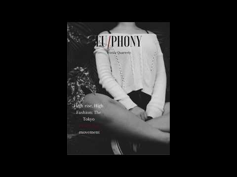
We started of with the cover, now as y'all blog viewers (shoutout to Y'all) know, I had a first cover draft. I went about replacing the picture with one of Sil or Jean. We first tried Sil and, admittedly, we felt like it looked good. The black-and-white of the picture made us want to pursue a different color scheme, especially with the previously existing, white-black-red, so we said "hey, why not change the color order?"
I ended up with this:

I liked it a LOT, if I'm being honest. I recognized (and was advised) to maybe try something different because the alignment at the moment was very weird and it honestly made the masthead look like Sil's face, and if i was gonna break conventions THAT hard, I had to get it right...To which I happened to agree with, LOL. With getting it right in mind, this then became a great first step.
The weirder part was the debate I had about fonts for like, an hour with myself. See, I had originally used Fire Sans Light, but with sil now in the pic with a more jagged lighting scheme, the font seemed..weak. So I tried the next best Fire Sans font, BOLD. It looked like this:

^Yes, this was an actual internal debate I had with myself.
After this, I contemplated what to even put on a two-page spread, until Isa pointed out a picture of Jean she really liked. Once she die, we switched laptops for a small bit and she sent me the pictures and taught me how to use her editing software, POLARR. She taught me to use her custom filters too, so that post production knowledge came in SUPER handy considering I very much need it.Post-editing and enlargement, this was the two-page spread.

That same knowledge led us to making THIS bad boy of a cover:

^Dope, am I right ladies?
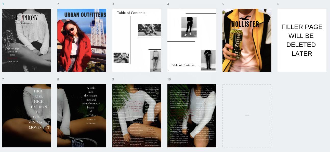
Anyways, Through the next period onto the night (at least time of posting), we worked on both our magazines and came out with very similar lay-outs after running edits and ideas by each other, as well as checking for similarity:
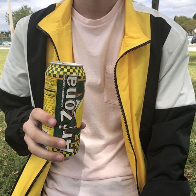
The two ads were pictures I had taken over the summer. One is of me in a Pretty trendy outfit holding an Arizona can, and the other is of my sister posing for her Instragram:

these are good, but I am a little sad Isa said I couldn't use my favorite picture as an ad:

Sad times, truly. Well, at least not in terms of this magazine, we're making progress and we shall be chillin' like a villain by the end.
-Let's get this bread.


No comments:
Post a Comment