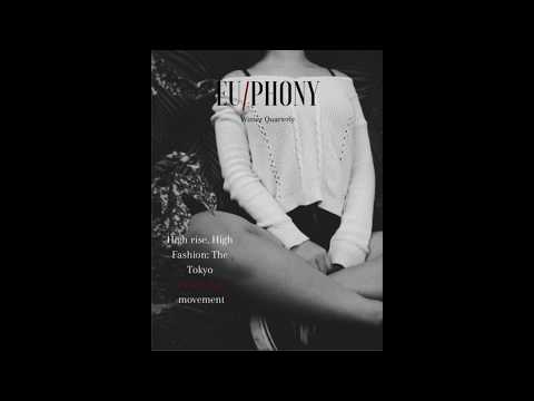
It was hard to get on here (seriously, it took like 3 different JPG's to get it on this blog from Canva), but here it is. So Essentially this is sort of what I'm envisioning for the issue's final look. Originally, I thought I would go heavy with dark colors and just have a drab black/white/grey aesthetic because that's what I shortsightedly envisioned for myself. After self-reflection, by which I mean I learned what good-looking layouts are and how to emulate them, I saw the truth: My previous idea was... ~not good~. So I decide to embrace what I liked after looking at examples and throw away what was clearly hot garbage and throw up a design. I decided to also add some red, surprisingly, but the reason for that was after meeting with Isa and contrasting our mastheads to make sure they match (as per requirements). I saw hers was black with a red / in it(largely cause many popular Alt. Fashion magazines have their names broken up with designs), and I asked her "what if I went with like the design you have but switched it up? " She was really down for the idea, So I decided to implement it. For the image, I googled "Minimalist fashion", rather un-creatively, but ended up with a rather good image to use. Without further ado, Here's the design:

-Let's get this bread.


No comments:
Post a Comment